
In trying to establish its identity, amidst the often puzzling fashions of the 1990's, many of the clubs around the league were outfitted in kits with bright colours and strange designs.
Like the National Hockey League, which also saw teams come out with some strange jerseys in those years, it was as if many of the teams in the sides were saying, "Look kids: we're cool, we're hip, buy our kits!"
Many of these jerseys looked bizarre at the time, particularly to those of us who grew up watching European football, but now years later they look even crazier.
Here are a few selections of the high lights and low lights of some of the MLS' early jerseys:
1997 Kansas City Wizards
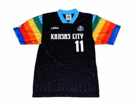
This could almost be filed under "it's so crazy, it works." With the primary front of the jersey black and a crisp logo, but with those rainbow sleeves, it's a case of business in the front and a party on the sides. This kit is so bizarre and so '90's, I'd probably buy one if I saw it for a good price.
1996 Tampa Bay Mutiny

1997 Columbus Crew

Although I was never a fan of the Crew's workmen in hardhats logo, which is also imprinted in the black material on this kit, I still believe that this was one of the better jerseys in the league's early years. The simple white and yellow hooped sleeves and simple yellow v-neck are terrific. It's a very Borussia Dortmund looking kit, so one for the hipsters.
1996 San Jose Clash
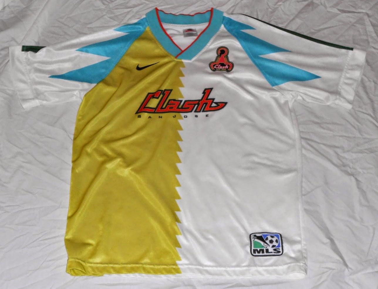
The San Jose Clash, as they were known before rebranding as the Earthquakes in 1999, released an initial kit that was simply a full frontal assault on the eyes. The buzz-saw split between the white and the gold on the front is pure amateur hour by the designer and the inclusion of that horrible '90's teal sends this awful kit over the edge.
1998 LA Galaxy
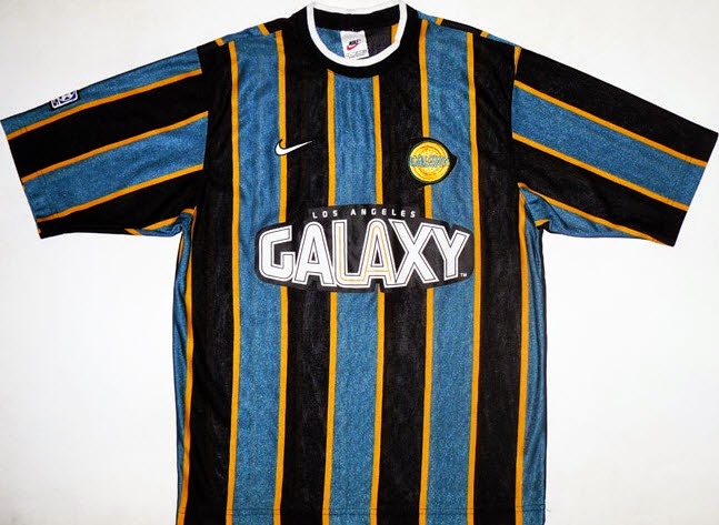
Before Beckham, there was the bathrobe. Despite the LA Galaxy's success in the first five years of league play, they couldn't quite land on a good design for their kits and that's best exemplified by this effort that looked like either a bathrobe or a poor choice of curtains. The pale blue just didn't really work with the black and gold, while LA's logo didn't fit with this kit one bit.
1999 Miami Fusion
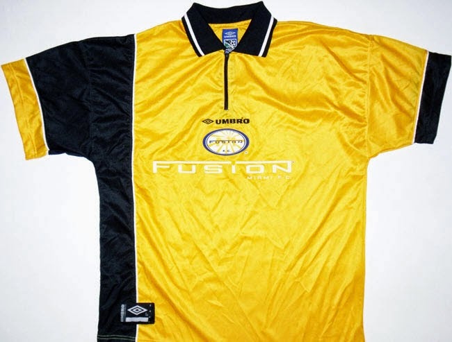
Although it looks more like a referee's jersey than an actual team shirt, this particular kit that the defunct Miami club came out with wasn't too bad. The fusion text across the front, with the odd typeface, isn't the best, but the nice clean collar and contrasting black and yellow look pretty solid.
1999 New England Revolution
Apart from the 'Revolution' text on the navy blue bar across the chest, this is a fairly restrained and well designed shirt from the early MLS era. It has a nice collar, that was used on quite a few Reebok and Umbro kits from that era, and the clubs colours are well represented in the kit's design. It's incredible though that New England still have the same logo today and haven't modernized it.
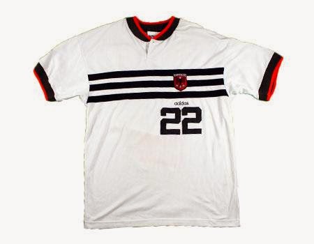
1996 DC United

The daddy of MLS kits. Almost twenty years after it's release this is still arguably the best kit the league has seen. Some may argue that it's just a glorified Adidas training top, but I'd counter that some people just don't understand simplicity. The kit is clean, without any crazy colours or patterns, and has brilliantly bold names and numbers on it. This kit, and their almost equally impressive white change shirt, symbolizes, to me at least, that in the early years of the league, DC United were doing things as well off the pitch as they were doing on it.


You are a blogger and now my motivation. I simply love the blog entry. Its exceptionally instructive, intelligent and quality substance. I wish all of you good karma for your coming online journals and posts. Continue sharing!
ReplyDeletekc mavericks team store