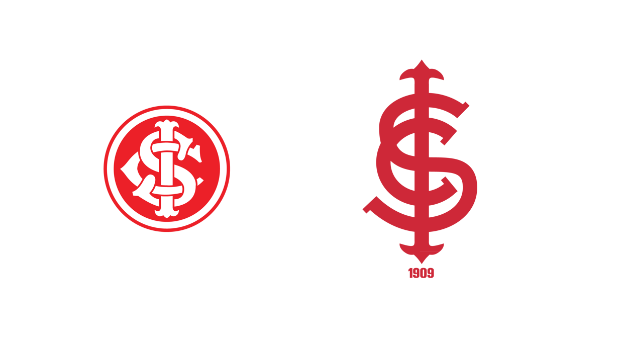
Brazilian designer Ricardo Carvalho redesigns the image of Porto Alegre club S.C. Internacional. Personally, I always believed that this particular club's identity was one of the strongest in South American football, but Carvalho's attempt is quite intriguing.
Here's the project description in Ricardo's own words, translated to English.
For this project, were developed in addition to the 3 kits from the club, a new crest, regarding history and earlier brands used by the team. This new brand directs a new brand strategy for Internacional , with examples of applications and brand guidelines. The idea of using the example of the Internacional Team came from an old project that further studies were created for the design of the symbols of the teams for some of the leading football teams, updating both crests and jerseys, trying to solve some problems of readability and application in order to let each exclusive and unique brand. This project can be seen here.
The graphics for the kits were inspired by the new Beira Rio stadium that was renovated for the 2014 World Cup. The first kit shows the red color in major scale, and the away kits is all white. The first goalkeeper kit is yellow and green, inspired by Rio Grande do Sul's flag, thestate where Internacional
is located, and the second one shows the dark gray color.
You can follow Ricardo on Twitter @_rccarvalho
Evolution
Kits


0 comments :
Post a Comment