
Koichi Endo is a designer from Vancouver, Canada and his rebranding concept for Japanese club Yokohama F Marinos is the first installment in FootyFair's newest weekly addition, Concepts. In it we will feature a single concept once a week, a design that is will very likely never see the light of day in reality, but one that we believe should be seen nonetheless.
Formed in 1972 as Nissan Motors FC, the "Tricolore" have established traditions and history in Japan. Koichi Endo seems to understand the importance of tradition as when a club goes through a redesign the supporters rarely approve anything that does not stay in line with the important features ingrained in its history.
Here is how Endo himself describes this project:
As a kid, I've grown up watching Marinos play, and I wanted to give little something back by doing what I love.
Since the opening of J-League, a lot has changed in design and our life style. To attract wide range of people from around world is tough in a smaller league. So I came up with this case study / proposal for Marinos. What rebranding can do for their team.
The Crest

For the main crest design (which is what the entire concept is based on) Endo stays with the original red, white and blue colors and stripes featured on the current Marinos badge. He uses the anchor and three stars above the crest, but chooses to eliminate the football, which in reality looks a bit outdated on the crest currently used by the club. As well, he takes out the three birds and the laurel leaves, replacing the leaves with a simple gold accent, giving the new design a clean modern look.
The Alternate
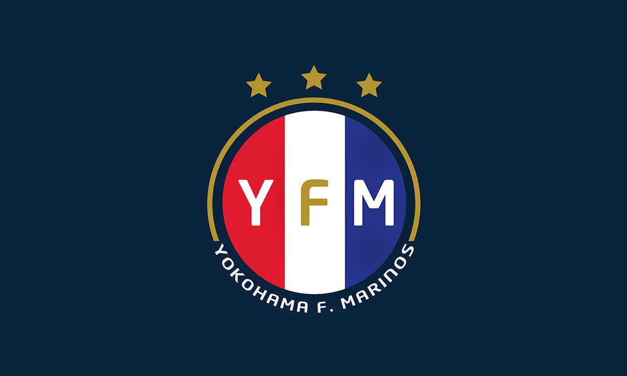
Although an alternate crest is not a requirement, Endo presents an option turning the stripes to a vertical position, making a great fit for the abbreviation of the club, "YFM".
The Kit

Perhaps a bit too simple (especially for the Japanese market), the kits follow a very simplistic design. Personally I would suggest that the alternate shirt's main color is a very interesting one, but I would maybe consider a different color for the shorts, instead of the black used in this example. The home and away follow the traditional three colors, with the minimalist design putting a lot more emphasis on the sponsor and new crest than anything else.
Other Applications

Endo goes on to design how the new brand would feature in other applications on things such as mugs, mobile apps and other print. The new design is sharp and modern, while still honoring the traditional symbol and various details likely very important for Yokohama F Marino's fans.


0 comments :
Post a Comment