Once upon a time football kits were simply designed for people to play football in. But one day a savvy young marketing genius deduced that grown men would pay ridiculous amounts of money to wear the same kits that their favourite teams take to the field in. I'm not judging by the way, as my spare room is filled with football kits and various jerseys from other sports.
As fashion trends have fluctuated and changed over the years, many football clubs have attempted to keep up with the styles of the times, often with embarrassing results. Below are ten diabolical kits, some of which are so bad they rebound to being good:


.JPG)


Estonia 1996
The designer of Estonia's National Team kit in 1996, had the bright idea of taking the top quarter of a garish 8-bit inspired festive sweater and combining it with a Mayan blanket he found at a market in Cancun. The bottom portion of this kit also reminds me of the bicep tattoos of guys who walk around asking, "Yo, do you even lift, bro?"Stoke 1997
Microsoft Office can be blamed for many things, including the horrible standard résumé template that the designer of this kit used to get his gig at Stoke City. This MS Word "power user" also made sickening use of Word Art as he splashed "Stoke" across this away kit, just in case you forgot what team's kit you were wearing. Oh, and the less said about the Photoshop noise filter effect and that gradient behind the text, the better.Birmingham City 1972
In the early 1970's West Germany were a good side. A damn good side in fact. Birmingham City's crack design team decided that if you want to be champions you need to look like champions, so they decided to craft a kit out of the German flag. Needless to say it didn't work, as they went from just being a crap team to being a crap team in a German flag.Newcastle United 2009
As if relegation and the bizarre antics of owner Mike Ashley weren't bad enough for the Toon Army to endure, the club released this peach and tangerine dream of a kit. Instead of playing football, Newcastle's players looked like they should be entertaining children with balloon animals or perhaps selling ice cream in these little numbers.Reggina 2012
The tricky thing with football kits is that most modern players in the top professional leagues are built like Adonis', with chiseled frames. A lot of football supporters however have beer guts. So how do you design a kit to accommodate both body types? Easy. Screen print muscles on a football kit and then even a shut-in who washes himself with a rag on a stick can look like a perfect human specimen. Well, that was the theory at least.Colorado Caribous 1978
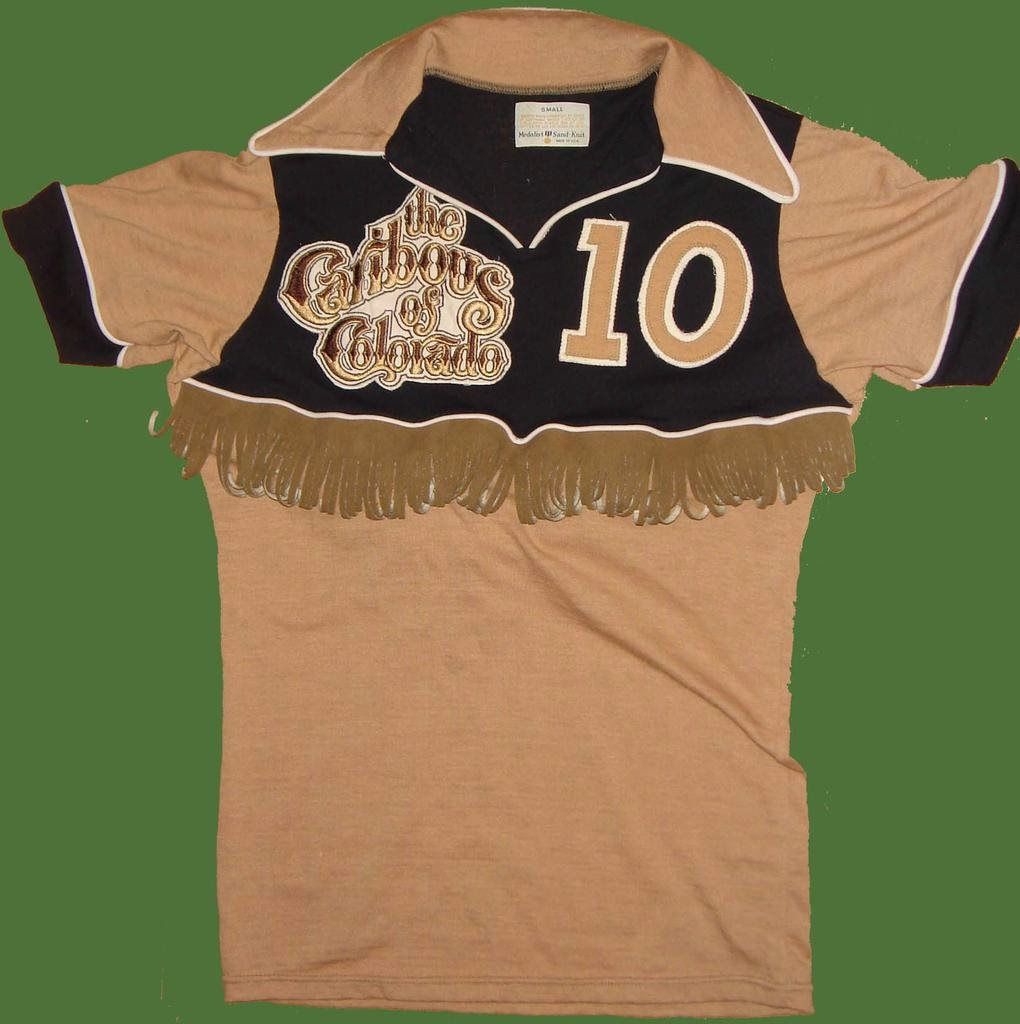
If Will Smith's Wild Wild West taught us one thing it's that the western genre doesn't mix that well with other genres. That rule also applies to football, as the Caribous of the old NASL illustrated with this cowboy inspired nightmare. This is perhaps the only time a leather fringe has featured on the jerseys of a professional soccer team, and that's for the best really.Fiorentina 1992
Just take a look at the shoulders of this kit and see if you can spot the problem. I'll give you a hint: it's a controversial political symbol, and if there's one symbol you wouldn't want to put on your jersey, accidentally or otherwise, it would be this one.Hull City 1992
Hull City's nickname is the Tigers, but that's no excuse for putting out a kit with a print that wouldn't look out of place if it was a throw rug in a tacky divorcee's "lair of bad decisions". It just needs more cigarette burns and red wine stains.Juventus 2011
In Serie A when a club wins 10 Scudetti they are given the right to put a star on their kits, however they are not given the right to put a giant star on a bright neon pink shirt. With this effort in 2011, Juventus made it abundantly clear that they've won a lot of Scudetto's and they prefer Wham era George Michaels over Faith era George Michaels.


0 comments :
Post a Comment