Moving on to Groups C and D in this summer's Euro tournament in France and as far as team kits and shirts are concerned the designs are indeed becoming more interesting than those we graded in Part 1 of this feature.
Group C
Germany

Defending world champions will be wearing a very classic white home shirt this summer, with minimal black trim. This minimalistic approach is contrasted by the very unique alternate shirt design which features the colors green, gray, black and white; a combination that sounds odd but comes together very nicely on this particular shirt.
Overall Grade: B
Northern Ireland

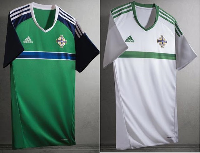
There were fans that were not too pleased with this design when it was just released in Norther Ireland, but while they have their reasons for disliking the design, I personally think it's just a bit too boring. The colors used in Norther Ireland's kits work well together and the stripe just below the chest almost makes us forget that this is the same template used for Wales' super boring home kit. This design may not be spectacular, but it is distinguishable from all other in this summer's tournament and for that reason gets a small bump in its grade.
Overall Grade: C
Poland

I've got a huge problem with this design. First of all, I'm Ukrainian and feel that Poland will be our biggest obstacle in this summer's Euro tournament. Secondly, I haven't been a fan of Nike's shirt designs of late. That said, these shirts for Poland look pretty solid! Both designs are sharp and together with the subtle design on the front and the two-tone red color on the alternate shirts makes this number a very nice and clean one.
Overall Grade: B
Ukraine

Well, of course I have to stay as unbiased as possible on this particular one, but I really believe these shirts are pretty cool. For one, I think the design on the front is pretty unique but also subtle enough. Also, the collar used here by Adidas is very similar to the collar style of a traditional Ukrainian shirt which makes the overall look seem very traditional and fitting. As a Ukrainian I was very pleased with this design from Adidas.
Overall Grade: B+
Group D
Croatia

Featuring the unique checkered red and white look as always, Croatia's 2016 design is made unique by the warping effect of the cubes and the inclusion of the same design on the alternate shirts with a blue on blue concept. Overall, Nike has managed to compose a solid look for the Croatians once again.
Overall Grade: B
Czech Republic

Puma's choice of design features on the home kit for the Czechs is pretty odd. The arrows pointing down to the footballers' crotch area is quite odd, but while the red shirts at least have a somewhat unique look, the alternate shirts are very boring and will not differentiate the Czechs from any other plain shirt wearing nation in the tournament.
Overall Grade: C-
Spain

Boring is definitely not a word anyone will use to describe Spain's look this summer. The home shirts are pretty neat, featuring Spains traditional colors together with a subtle triangle pattern design all over the jersey. The alternate look will very likely be the most unique shirt of the tournament with a triangular design which includes a variety of red and yellow shades spreading from the country's crest.
Overall Grade: B+
Turkey

While some may have a seizure looking at Turkey's Nike kits, I absolutely love these kits. The design on the front of the shirt is one of a kind, but the gradient that takes the shirt from red to black is what puts it all together. The alternate kits are even better as the white, bright baby blue and red come together so nicely with the same line pattern design. I think Nike hit a home run with this number and I cannot wait to see the team wear those on the pitch.
Overall Grade: A


The Spanish alternate top is certainly very distinctive!
ReplyDelete