
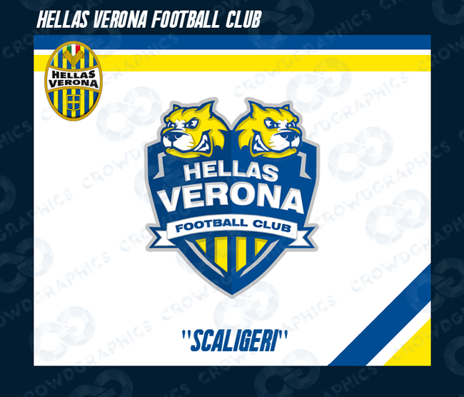
Italian designer "Crowdgraphics" took his love of American sports to his countiry's football league by redesigning every Serie A (2015-16) club's historic badge to resemble the style of American team logos. I, personally am a more traditional kind of guy when it comes to football crests, nonetheless, it was very interesting to take a look at how Italian club identities may have looked if they were all designed by a sports logo artist from North America.
Let us know what you think. Would you suggest any of the clubs below to switch to their "Americanized" look? For me there is one crest that stands out and may be a pretty good alternative to the original; it's that of Atalanta.


Parts of the Genoa layout are ripped from Chad B Stilson's Grand Rapids Griffins design: https://dribbble.com/shots/1019696-Grand-Rapids-Griffins-Concept
ReplyDeleteThe wolf on Roma is from Aurélien Mahaut's Michigan Wolves design: https://dribbble.com/shots/1366211-Michigan-Wolves
I'm 100% certain that the head on the AC Milan design is taken from somewhere else and I'd be surprised if parts of most of these designs aren't just stolen from other designers.