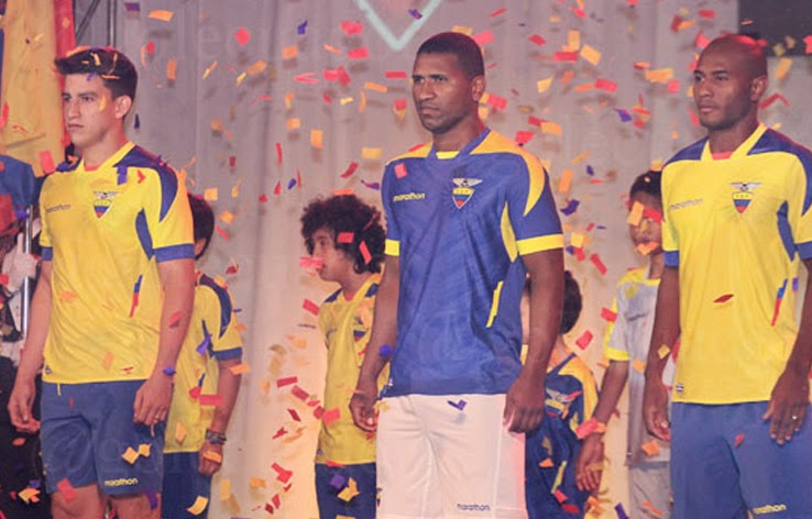
Group by group we are looking at the kits of this year's World Cup nations. We let you know what we think, and whether you agree or not is up to you, but you can let us know by commenting below.
Ecuador
Look at the faces of the Ecuadorians sporting this number below. Their face expressions predict the grade I will be giving their kit, which is made by little-known Ecuadorian manufacturer Marathon. To describe this creation in two words would be "nothing special". With a few random shoulder and armpit shapes to create the illusion of detail, these kits present nothing in terms of creativity or concept. In Marathon's almost two decades of dressing the Ecuadorian national team, there has been no progress to distinguishing them from any other squad that has to settle for a "low-budget" brand.
Grade: D

Switzerland
The Swiss have never impressed with their creativity when it comes to national team kits, and this year will not be an exception. While some added details like that enormous cross on the front of the jersey are interesting, overall the kits are still traditionally boring. Puma does receive bonus points for nicely organizing the allignment of the symbols on the chest, something Adidas skipped all together with Japan's shirts.
Grade: C

Honduras
Another low-end manufacturer Joma, managed to at least make Honduras' shirt look nice and clean. There is not much detail work especially in the home whites, but the shade of blue together with the lighter version on the shoulders and collar works quite nicely. If only the Honduran association redesigned that over-sized badge of theirs.
Grade: C+
France
While this is a pretty simple looking design, Nike managed to create something very special for Les Bleus with this year's kits. The home shirt blue is quite the drastic change for the French team, but the dark tone works so well with the white collar and a crest that's been simplified to make it look very sharp. The away shirt definitely shows that Nike hasn't lost it's taste for a creative concept just yet as well. The stripes across the white jersey make me think of street mimes, a concept that is very true to French tradition. Although quite simple and classy, the French shirts have a great balance of color and concept and will stand out this summer in Brazil.
Grade: A
OTHER GROUPS >>


0 comments :
Post a Comment