Group by group we are looking at the kits of this year's World Cup nations. We let you know what we think, and whether you agree or not is up to you, but you can let us know by commenting below.

Colombia
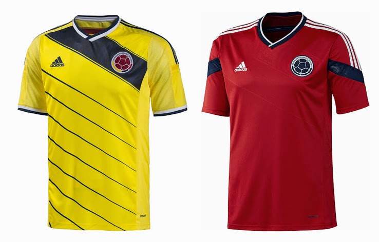
Adidas did a decent job on the Colombian kits, finding balance between the traditional side of Colombian colors and inserting a unique touch in both the home and away shirts. The home kit showcases the popular Colombian yellow/blue color combination, with the stripes across the front of the shirt giving it a bit of a new dimension. The away shirts, while looking quite templated, pay a tribute to Colombia's long-standing red home kits used in the 70s, 80s and the early 90s before the country's football association together with Umbro decided to switch to a yellow just before the 1994 World Cup, a style they have used since. The 1 color crest on the away shirt also makes it look strong.
Grade: B-
Greece
How exciting. Although Greece has never been known to allow their manufacturers to come up with anything too spectacular for their national team's kits, this number is just plain boring. A football shirt that you can wear to a golf tournament without anyone looking at you twice, is just not right. It's "classy" I'll give them that, perhaps too much so.
Grade: C

Ivory Coast
With all the creative freedom in the world, Puma managed to come up with this terrible shirt for the Ivorians, how disappointing. First, the home shirt orange shade is absolutely awful compared to previous designs, and the away green is no better. That, together with the fact that they managed to hide an interesting shoulder pattern by making it only a tad darker makes this year kit a total failure.
Grade: F

Japan
Full marks for trying, no marks for succeeding. It's been 20 years since Asics pulled off that infamous flame design for the Samurai Blue, and while Adidas attempted to create something original, it just doesn't come together at all. The home jersey is not a bad attempt, but the florescent yellow on the away shirt and the placement and sizing of the flag, crest and Adidas patches is just totally wrong. Luckily, with none of the others in the group wearing blue as their predominant colors and Japan's likely early exit from the tournament , we may never have to see 10 glow-sticks take to the pitch.
Grade: C-


11 glow sticks. :) Now that I DO want to see.
ReplyDelete